3. Specifying the grid designation process
Source:vignettes/articles/grid-designation-process.Rmd
grid-designation-process.RmdThe workflow for simulating a biodiversity data cube used in gcube can be divided in three steps or processes:
- Occurrence process
- Detection process
- Grid designation process
This tutorial documents the third part of the gcube simulation workflow, viz. the grid designation process.
# Load packages
library(gcube)

library(sf)        # work with spatial objects
library(dplyr)     # data wrangling
library(ggplot2)   # data visualisation
library(ggExtra)   # enhance data visualisation
Input
The functions are set up such that a single polygon as input is enough to go through this workflow using default arguments.
The user can change these arguments to allow for more flexibility. As input, we create a polygon in which we simulate occurrences. It represents the spatial extent of the species.
polygon <- st_polygon(list(cbind(c(500, 1000, 1000, 600, 200, 100, 500),
                                 c(200, 100, 700, 1000, 900, 500, 200))))
The polygon looks like this.
ggplot() +
  geom_sf(data = polygon) +
  theme_minimal()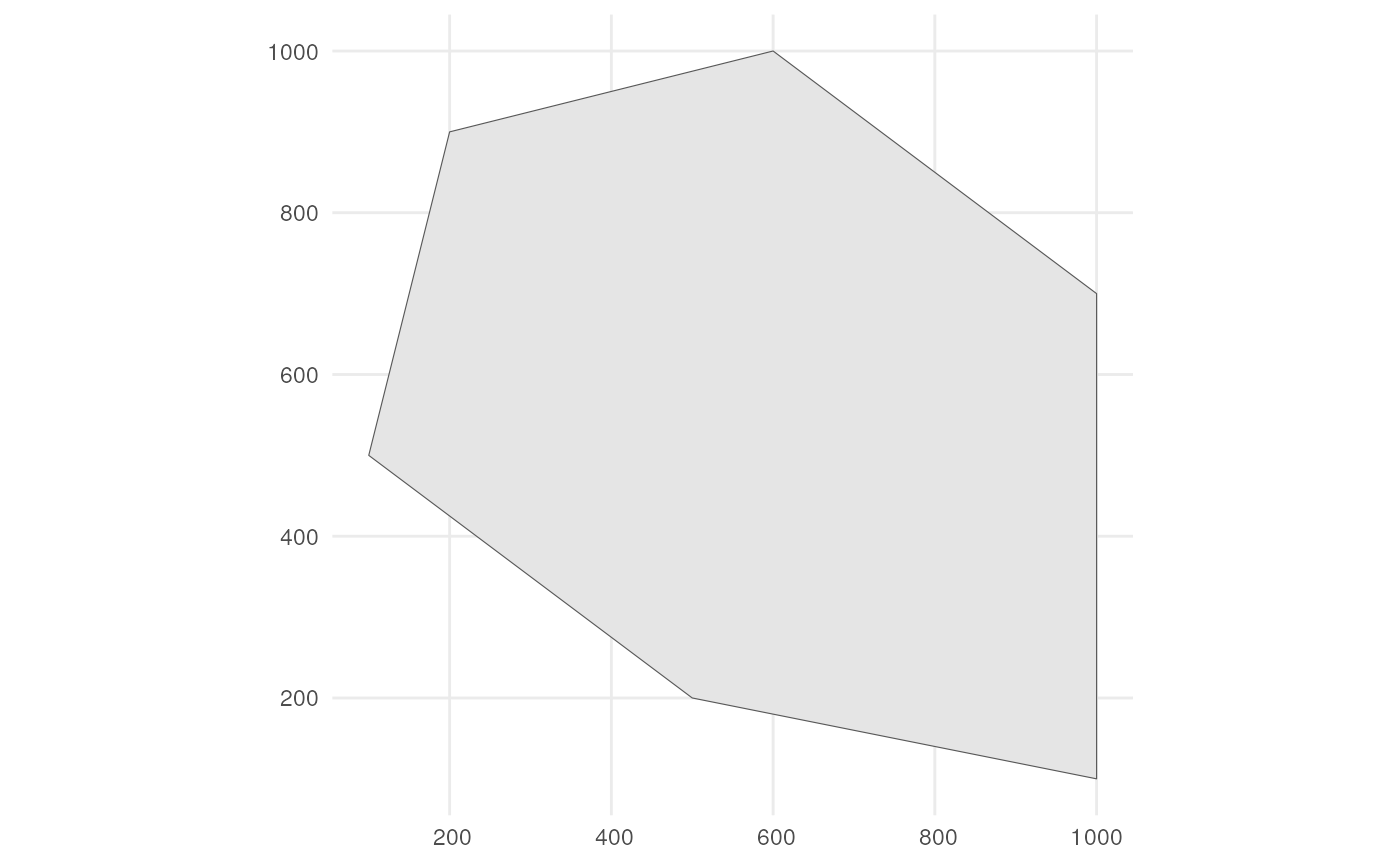
Also consider a road across our polygon.
# Define the road width
road_width <- 50

# Create road points
road_points <- rbind(c(100, 500), c(1000, 500))

# Create road-like polygon within the given polygon
road_polygon <- st_linestring(road_points) %>%
  st_buffer(road_width) %>%
  st_intersection(polygon) %>%
  st_polygon() %>%
  st_sfc() %>%
  st_as_sf() %>%
  rename(geometry = x)
The result looks like this.
ggplot() +
  geom_sf(data = polygon, fill = "lightgreen") +
  geom_sf(data = road_polygon) +
  theme_minimal()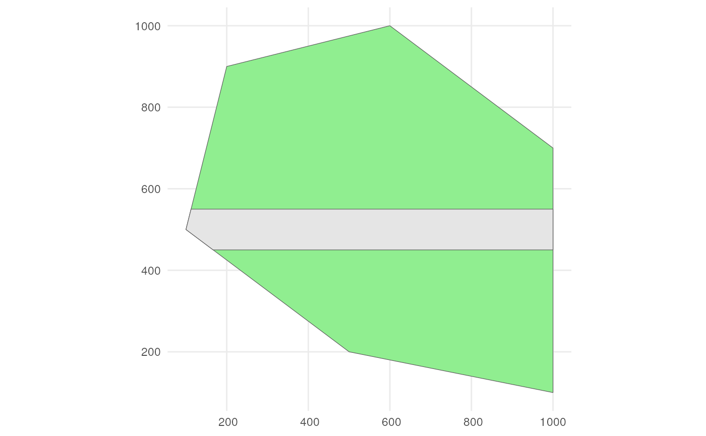
We can for example sample randomly within the polygon over 6 time points were we use a random walk over time with an initial average number of occurrences equal to 100 (see tutorial 1 about simulating the occurrence process).
occurrences_df <- simulate_occurrences(
  species_range = polygon,
  initial_average_occurrences = 100,
  n_time_points = 6,
  temporal_function = simulate_random_walk,
  sd_step = 1,
  spatial_pattern = "random",
  seed = 123
)
#> [using unconditional Gaussian simulation]
This is the spatial distribution of the occurrences for each time point
ggplot() +
  geom_sf(data = polygon) +
  geom_sf(data = occurrences_df) +
  facet_wrap(~time_point, nrow = 2) +
  ggtitle("Distribution of occurrences for each time point") +
  theme_minimal()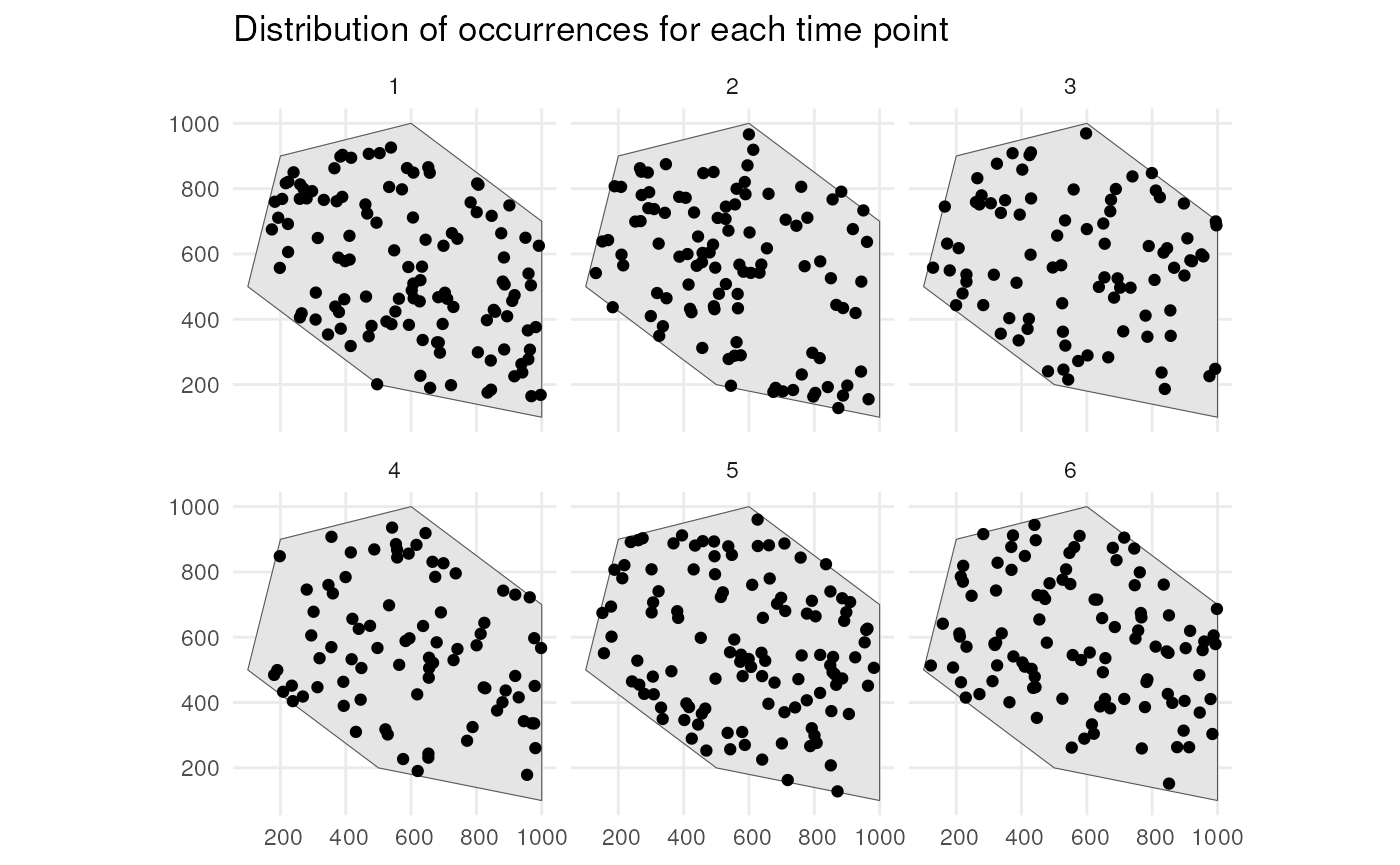
We detect occurrences using a 0.9 detection probability and a bias of 0.1 to detect occurrences on the road (see tutorial 2 about simulating the detection process).
detections_df_raw <- sample_observations(
  occurrences_df,
  detection_probability = 0.9,
  sampling_bias = "polygon",
  bias_area = road_polygon,
  bias_strength = 0.1,
  seed = 123
)
This is the spatial distribution of the occurrences for each time point
ggplot() +
  geom_sf(data = polygon, fill = "lightgreen") +
  geom_sf(data = road_polygon) +
  geom_sf(data = detections_df_raw,
          aes(colour = observed)) +
  scale_colour_manual(values = c("blue", "red")) +
  facet_wrap(~time_point, nrow = 2) +
  labs(title = "Distribution of occurrences for each time point") +
  theme_minimal()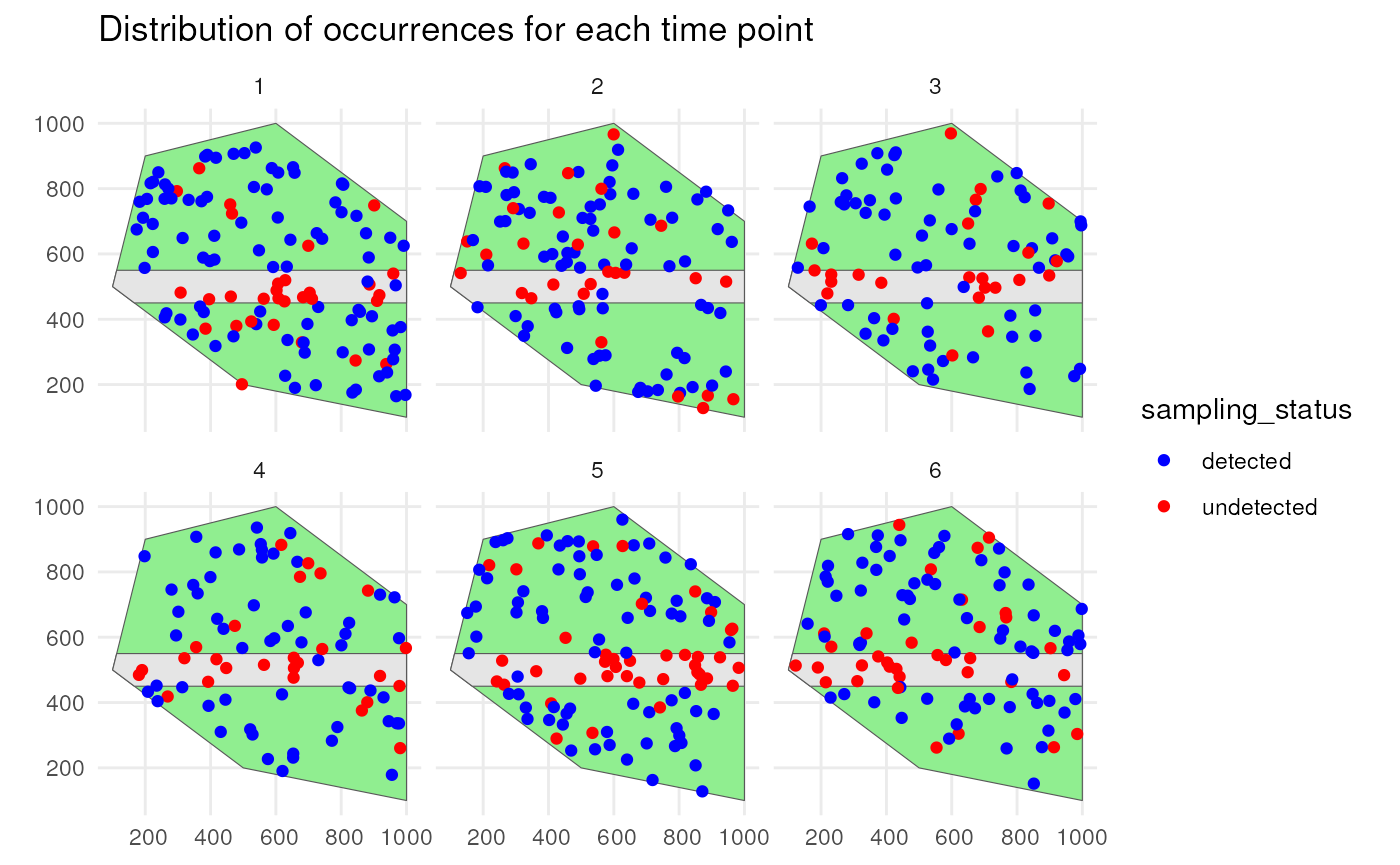
We only keep the detected occurrences and add 25 meters of uncertainty to each observation (see tutorial 2 about simulating the detection process).
# Keep detected occurrences
detections_df <- filter_observations(
  observations_total = detections_df_raw
)

# Add 25 m coordinate uncertainty
observations_df <- add_coordinate_uncertainty(
  observations = detections_df,
  coords_uncertainty_meters = 25
)
The final observations with uncertainty circles look like this.
# Create sf object with uncertainty circles
buffered_observations <- st_buffer(
  observations_df,
  observations_df$coordinateUncertaintyInMeters
)

# Visualise
ggplot() +
  geom_sf(data = polygon, fill = "lightgreen") +
  geom_sf(data = road_polygon) +
  geom_sf(data = buffered_observations,
          fill = alpha("firebrick", 0.3)) +
  geom_sf(data = observations_df, colour = "firebrick", size = 0.8) +
  facet_wrap(~time_point, nrow = 2) +
  labs(title = "Distribution of observations for each time point") +
  theme_minimal()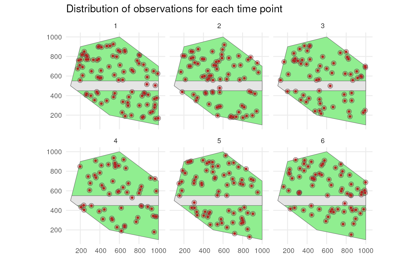
Grid designation
Now we can make a data cube from our observations while taking into
account the uncertainty. We can create the grid using the
grid_designation() function.
?grid_designationWe also need a grid. Each observation will be designated to a grid cell.
cube_grid <- st_make_grid(
  st_buffer(polygon, 25),
  n = c(20, 20),
  square = TRUE
) %>%
  st_sf()
The grid looks like this.
ggplot() +
  geom_sf(data = polygon) +
  geom_sf(data = cube_grid, alpha = 0) +
  theme_minimal()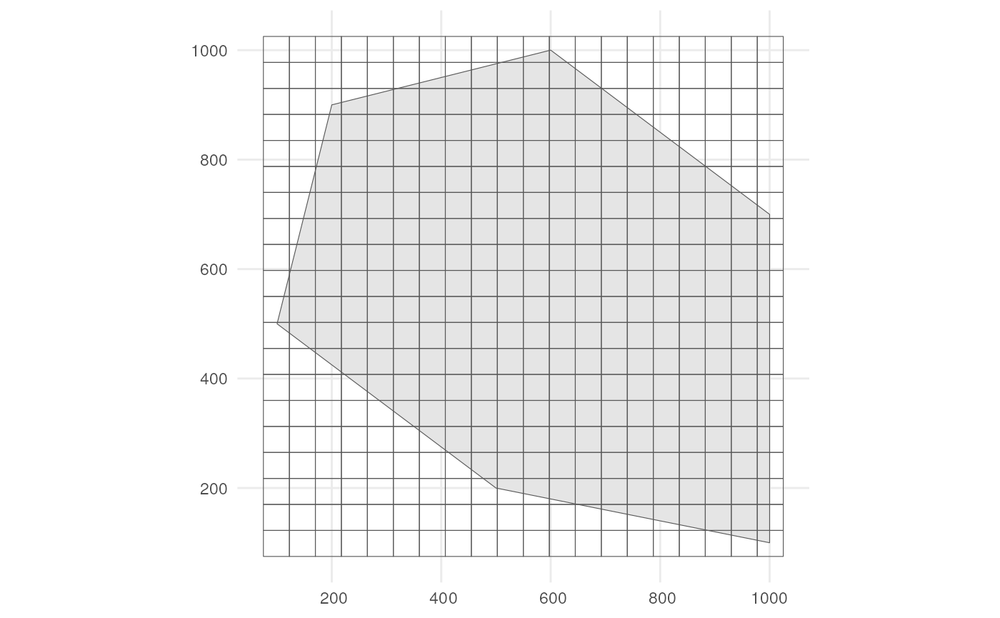
How does grid designation take coordinate uncertainty into account?
The default is "uniform" randomisation where a random point
within the uncertainty circle is taken as the location of the
observation. This point is then designated to the overlapping grid cell.
Another option is "normal" where a point is sampled from a
bivariate Normal distribution with means equal to the observation point
and the variance equal to
(-coordinateUncertaintyInMeters^2) / (2 * log(1 - p_norm))
such that p_norm % of all possible samples from this Normal
distribution fall within the uncertainty circle. This can be visualised
by using these supporting functions.
?sample_from_uniform_circle
?sample_from_binormal_circle
Lets create a single random point with 25 meter coordinate uncertainty. We sample 1000 times using uniform and normal randomisation to look at the difference between the methods.
# Create point and add coordinate uncertainty
point_df <- tibble(
  x = 200,
  y = 500,
  time_point = 1,
  coordinateUncertaintyInMeters = 25
) %>%
  st_as_sf(coords = c("x", "y"))

# Number of simulations
n_sim <- 1000
We take 1000 samples with uniform randomisation.
list_samples_uniform <- vector("list", length = n_sim)
for (i in seq_len(n_sim)) {
  sampled_point_uniform <- sample_from_uniform_circle(point_df)
  sampled_point_uniform$sim <- i
  list_samples_uniform[[i]] <- sampled_point_uniform
}
samples_uniform_df <- do.call(rbind.data.frame, list_samples_uniform)
We take 1000 samples with normal randomisation
list_samples_normal <- vector("list", length = n_sim)
for (i in seq_len(n_sim)) {
  sampled_point_normal <- sample_from_binormal_circle(point_df, p_norm = 0.95)
  sampled_point_normal$sim <- i
  list_samples_normal[[i]] <- sampled_point_normal
}
samples_normal_df <- do.call(rbind.data.frame, list_samples_normal)
# Get coordinates
coordinates_uniform_df <- data.frame(st_coordinates(samples_uniform_df))
coordinates_normal_df <- data.frame(st_coordinates(samples_normal_df))
coordinates_point_df <- data.frame(st_coordinates(point_df))

# Create figures for both randomisations
scatter_uniform <- ggplot() +
  geom_point(data = coordinates_uniform_df,
             aes(x = X, y = Y),
             colour = "cornflowerblue") +
  geom_segment(data = coordinates_point_df,
               aes(x = X, xend = X + 25,
                   y = Y, yend = Y),
               linewidth = 1.5, colour = "darkgreen") +
  geom_label(aes(y = 503, x = 212.5, label = "25 m"), colour = "black",
             size = 5) +
  geom_point(data = coordinates_point_df,
             aes(x = X, y = Y),
             color = "firebrick", size = 2) +
  coord_fixed() +
  theme_minimal()

scatter_normal <- ggplot() +
  geom_point(data = coordinates_normal_df,
             aes(x = X, y = Y),
             colour = "cornflowerblue") +
  geom_segment(data = coordinates_point_df,
               aes(x = X, xend = X + 25,
                   y = Y, yend = Y),
               linewidth = 1.5, colour = "darkgreen") +
  geom_label(aes(y = 503, x = 212.5, label = "25 m"), colour = "black",
             size = 5) +
  stat_ellipse(data = coordinates_normal_df, aes(x = X, y = Y),
               level = 0.975, linewidth = 1, color = "firebrick") +
  geom_point(data = coordinates_point_df,
             aes(x = X, y = Y),
             color = "firebrick", size = 2) +
  coord_fixed() +
  theme_minimal()
In the case of uniform randomisation, we see samples everywhere and evenly spread within the uncertainty circle.
ggExtra::ggMarginal(scatter_uniform, type = "histogram")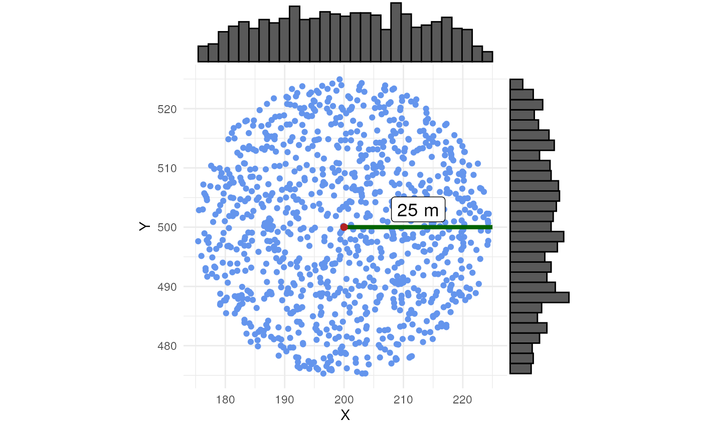
In the case of normal randomisation, we see some samples outside the
uncertainty circle. This should be 0.05 (=1 - p_norm) %. We
also see more samples closer to the central point.
ggExtra::ggMarginal(scatter_normal, type = "histogram")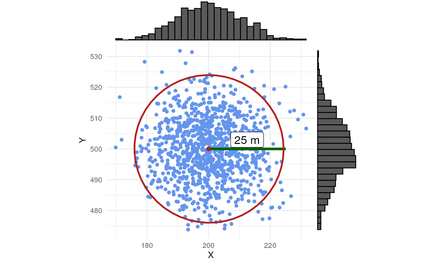
If no coordinate uncertainty is provided, the original observation point is used for grid designation.
Example
Now we know how to use the randomisation in
grid_designation(). By default we use uniform
randomisation. We create an occurrence cube for time point 1.
occurrence_cube_df <- grid_designation(
  observations_df,
  cube_grid,
  seed = 123
)
For each grid cell (column cell_code) at each time point
(column time_point), we get the number of observations
(column n, sampled within uncertainty circle) and the
minimal coordinate uncertainty (column
min_coord_uncertainty). The latter is 25 for each grid cell
since each observation had the same coordinate uncertainty.
head(occurrence_cube_df %>% st_drop_geometry())
#> # A tibble: 6 × 4
#>   time_point cell_code     n min_coord_uncertainty
#>        <int> <chr>     <int>                 <dbl>
#> 1          1 107           2                    25
#> 2          1 109           1                    25
#> 3          1 113           2                    25
#> 4          1 119           2                    25
#> 5          1 124           1                    25
#> 6          1 130           1                    25
Get sampled points within uncertainty circle by setting
aggregate = FALSE.
sampled_points <- grid_designation(
  observations_df,
  cube_grid,
  seed = 123,
  aggregate = FALSE
)
Lets visualise were the samples were taken for time point 1. Note
that no distinction is made between zeroes and NA values!
Every absence gets a zero value.
ggplot() +
  geom_sf(data = polygon) +
  geom_sf(data = occurrence_cube_df %>% dplyr::filter(time_point == 1),
          alpha = 0) +
  geom_sf_text(data = occurrence_cube_df %>% dplyr::filter(time_point == 1),
               aes(label = n)) +
  geom_sf(data = buffered_observations %>% dplyr::filter(time_point == 1),
          fill = alpha("firebrick", 0.3)) +
  geom_sf(data = sampled_points %>% dplyr::filter(time_point == 1),
          colour = "blue") +
  geom_sf(data = observations_df %>% dplyr::filter(time_point == 1),
          colour = "firebrick") +
  theme_minimal()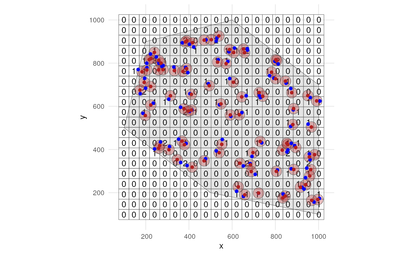
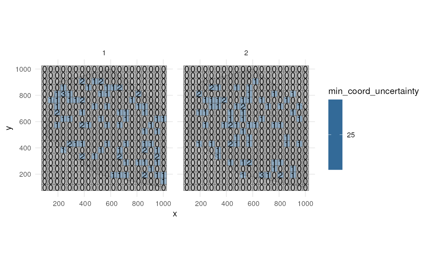
Visualise minimal coordinate uncertainty for time points 1 and 2.
ggplot() +
  geom_sf(data = polygon) +
  geom_sf(data = occurrence_cube_df %>% dplyr::filter(time_point %in% 1:2),
          aes(fill = min_coord_uncertainty), alpha = 0.5) +
  geom_sf_text(data = occurrence_cube_df %>% dplyr::filter(time_point %in% 1:2),
               aes(label = n)) +
  facet_wrap(~time_point) +
  theme_minimal()