Creates a time series plot of a calculated multi-species
biodiversity indicator (e.g. species richness or evenness), with an optional
smoothed trendline, and visualizes uncertainty. Requires an 'indicator_ts'
object as input. To plot a single-species indicator time series, use the
plot_species_ts() function instead.
Usage
plot_ts(
  x,
  min_year = NULL,
  max_year = NULL,
  title = "auto",
  auto_title = NULL,
  y_label_default = NULL,
  suppress_y = FALSE,
  smoothed_trend = TRUE,
  linecolour = NULL,
  linealpha = 0.8,
  ribboncolour = NULL,
  ribbonalpha = 0.2,
  error_alpha = 1,
  trendlinecolour = NULL,
  trendlinealpha = 0.5,
  envelopecolour = NULL,
  envelopealpha = 0.2,
  smooth_cialpha = 1,
  point_line = c("point", "line"),
  pointsize = 2,
  linewidth = 1,
  ci_type = c("error_bars", "ribbon"),
  error_width = 1,
  error_thickness = 1,
  smooth_linetype = c("solid", "dashed", "dotted", "dotdash", "longdash", "twodash"),
  smooth_linewidth = 1,
  smooth_cilinewidth = 1,
  gridoff = FALSE,
  x_label = NULL,
  y_label = NULL,
  x_expand = 0.1,
  y_expand = 0.1,
  x_breaks = 10,
  y_breaks = 6,
  title_wrap_length = 60
)
Arguments
- x
An 'indicator_ts' object containing a time series of multi-species indicator values. This is a required parameter with no default.
- min_year
(Optional) Earliest year to include in the plot.
- max_year
(Optional) Latest year to include in the plot.
- title
(Optional) Plot title. Replace "auto" with your own title if you want a custom title or if calling the function manually.
- auto_title
(Optional) Text for automatic title generation, provided by an appropriate S3 method (if calling the function manually, leave as NULL).
- y_label_default
(Optional) Default label for the y-axis, provided by an appropriate S3 method (if calling the function manually, leave as NULL).
- suppress_y
(Optional) If TRUE, suppresses y-axis labels.
- smoothed_trend
(Optional) If TRUE, plot a smoothed trendline over time (
stats::loess()).- linecolour
(Optional) Colour for the indicator line or points. Default is darkorange.
- linealpha
(Optional) Transparency for indicator line or points. Default is 0.8.
- ribboncolour
(Optional) Colour for the bootstrapped confidence intervals. Default is goldenrod1. Set to "NA" if you don't want to plot the CIs.
- ribbonalpha
(Optional) Transparency for indicator confidence interval ribbon (if ci_type = "ribbon"). Default is 0.2.
- error_alpha
(Optional) Transparency for indicator error bars (if ci_type = "error_bar"). Default is 1.
- trendlinecolour
(Optional) Colour for the smoothed trendline. Default is blue.
- trendlinealpha
(Optional) Transparency for the smoothed trendline. Default is 0.5.
- envelopecolour
(Optional) Colour for the uncertainty envelope. Default is lightsteelblue.
- envelopealpha
(Optional) Transparency for the smoothed trendline envelope. Default is 0.2.
- smooth_cialpha
(Optional) Transparency for the smoothed lines forming the edges of the trendline envelope. Default is 1.
- point_line
(Optional) Whether to plot the indicator as a line or a series of points. Options are "line" or "point". Default is "point".
- pointsize
(Optional) Size of the points if point_line = "point". Default is 2.
- linewidth
(Optional) Width of the line if point_line = "line". Default is 1.
- ci_type
(Optional) Whether to plot bootstrapped confidence intervals as a "ribbon" or "error_bars". Default is "error_bars".
- error_width
(Optional) Width of error bars if ci_type = "error_bars". Default is 1. Note that unlike the default 'width' parameter in geom_errorbar, 'error_width' is NOT dependent on the number of data points in the plot. It is automatically scaled to account for this. Therefore the width you select will be consistent relative to the plot width even if you change 'min_year' and 'max_year'.
- error_thickness
(Optional) Thickness of error bars if ci_type = "error_bars". Default is 1.
- smooth_linetype
(Optional) Type of line to plot for smoothed trendline. Default is "solid".
- smooth_linewidth
(Optional) Line width for smoothed trendline. Default is 1.
- smooth_cilinewidth
(Optional) Line width for smoothed trendline confidence intervals. Default is 1.
- gridoff
(Optional) If TRUE, hides gridlines.
- x_label
(Optional) Label for the x-axis.
- y_label
(Optional) Label for the y-axis.
- x_expand
(Optional) Expansion factor to expand the x-axis beyond the data. Left and right values are required in the form of c(0.1, 0.2) or simply 0.1 to apply the same value to each side. Default is 0.05.
- y_expand
(Optional) Expansion factor to expand the y-axis beyond the data. Lower and upper values are required in the form of c(0.1, 0.2) or simply 0.1 to apply the same value to the top and bottom. Default is 0.05.
- x_breaks
(Optional) Integer giving desired number of breaks for x axis. (May not return exactly the number requested.)
- y_breaks
(Optional) Integer giving desired number of breaks for y axis. (May not return exactly the number requested.)
- title_wrap_length
(Optional) Maximum title length before wrapping to a new line.
Value
A ggplot object representing the biodiversity indicator time series plot. Can be customized using ggplot2 functions.
Examples
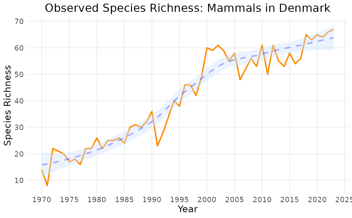
# default colours:
plot_ts(example_indicator_ts1,
y_label = "Species Richness",
title = "Observed Species Richness: Mammals in Denmark")
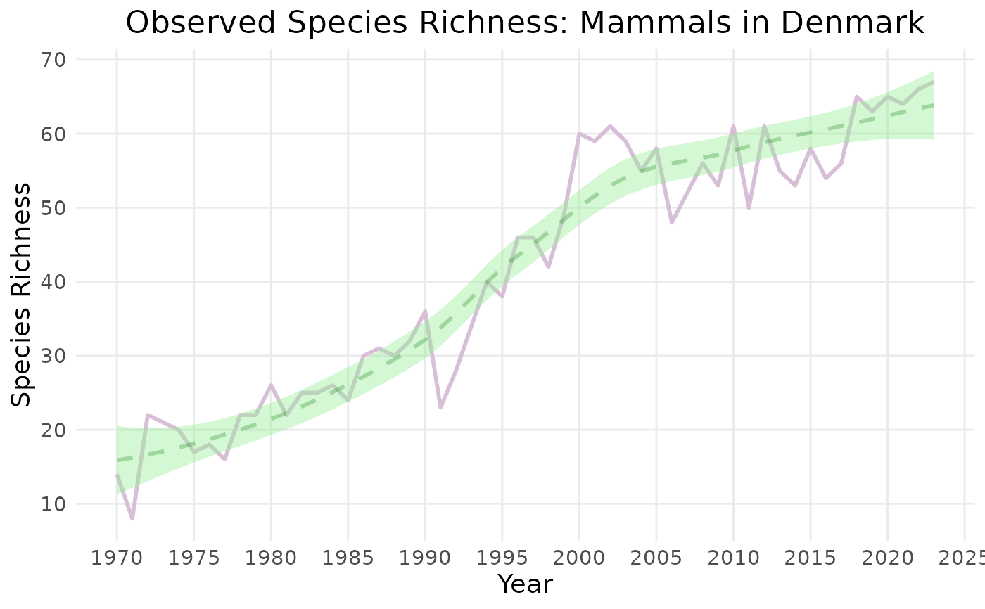
 # custom colours:
plot_ts(example_indicator_ts1,
y_label = "Species Richness",
title = "Observed Species Richness: Mammals in Denmark",
linecolour = "thistle",
trendlinecolour = "forestgreen",
envelopecolour = "lightgreen")
# custom colours:
plot_ts(example_indicator_ts1,
y_label = "Species Richness",
title = "Observed Species Richness: Mammals in Denmark",
linecolour = "thistle",
trendlinecolour = "forestgreen",
envelopecolour = "lightgreen")