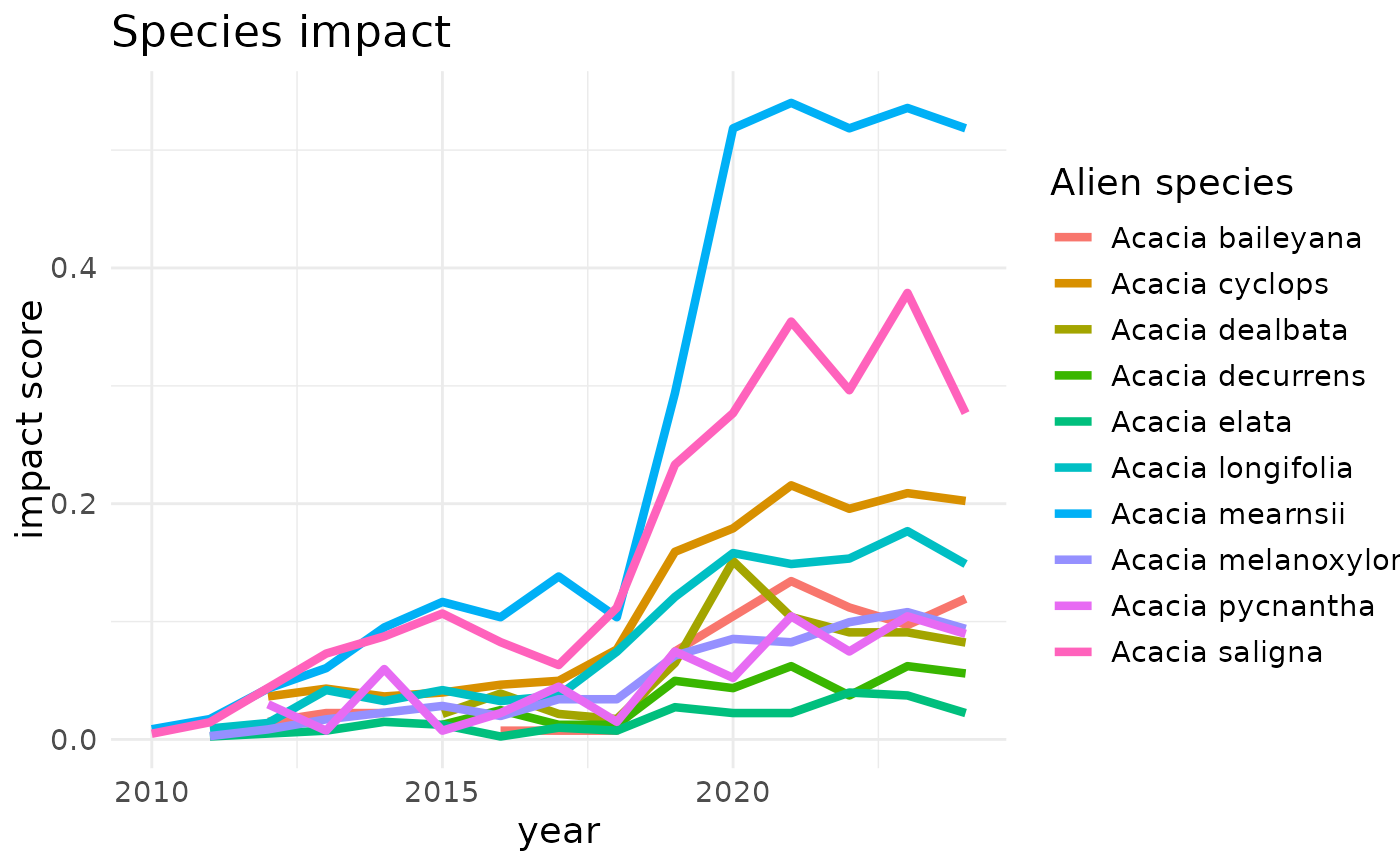
Produces a ggplot to show the trend of the species impact indicator.
Usage
# S3 method for class 'species_impact'
plot(
  x,
  alien_species = "all",
  linewidth = 1.5,
  title_lab = "Species impact indicator",
  y_lab = "Impact score",
  x_lab = "Year",
  text_size = 14,
  ...
)
Arguments
- x
A dataframe of impact indicator. Must be a class of "species_impact"
- alien_species
The character vector containing names of the alien species to be included in the plot. Default is "all" which plot all species in the data frame
- linewidth
The width size of the line. Default is 1.5
- title_lab
Title of the plot. Default is "Species impact"
- y_lab
Label of the y-axis. Default is "impact score"
- x_lab
Label of the x-axis. Default is "Year"
- text_size
The size of the text of the plot. Default is "14"
- ...
Additional arguments passed to geom_line
Value
The ggplot object of the species impact, with the y- and x-axes representing the impact score and time respectively.
See also
Other Plot:
plot.impact_indicator(),
plot.site_impact()
Examples
# create data cube
acacia_cube <- taxa_cube(
  taxa = taxa_Acacia,
  region = southAfrica_sf,
  res = 0.25,
  first_year = 2010
)

# compute species impact
speciesImpact <- compute_species_indicator(
  cube = acacia_cube,
  impact_data = eicat_acacia,
  method = "mean",
  trans = 1
)

# visualise species impact
plot(speciesImpact)